Internal Product • 2022
Mobile UX + Performance
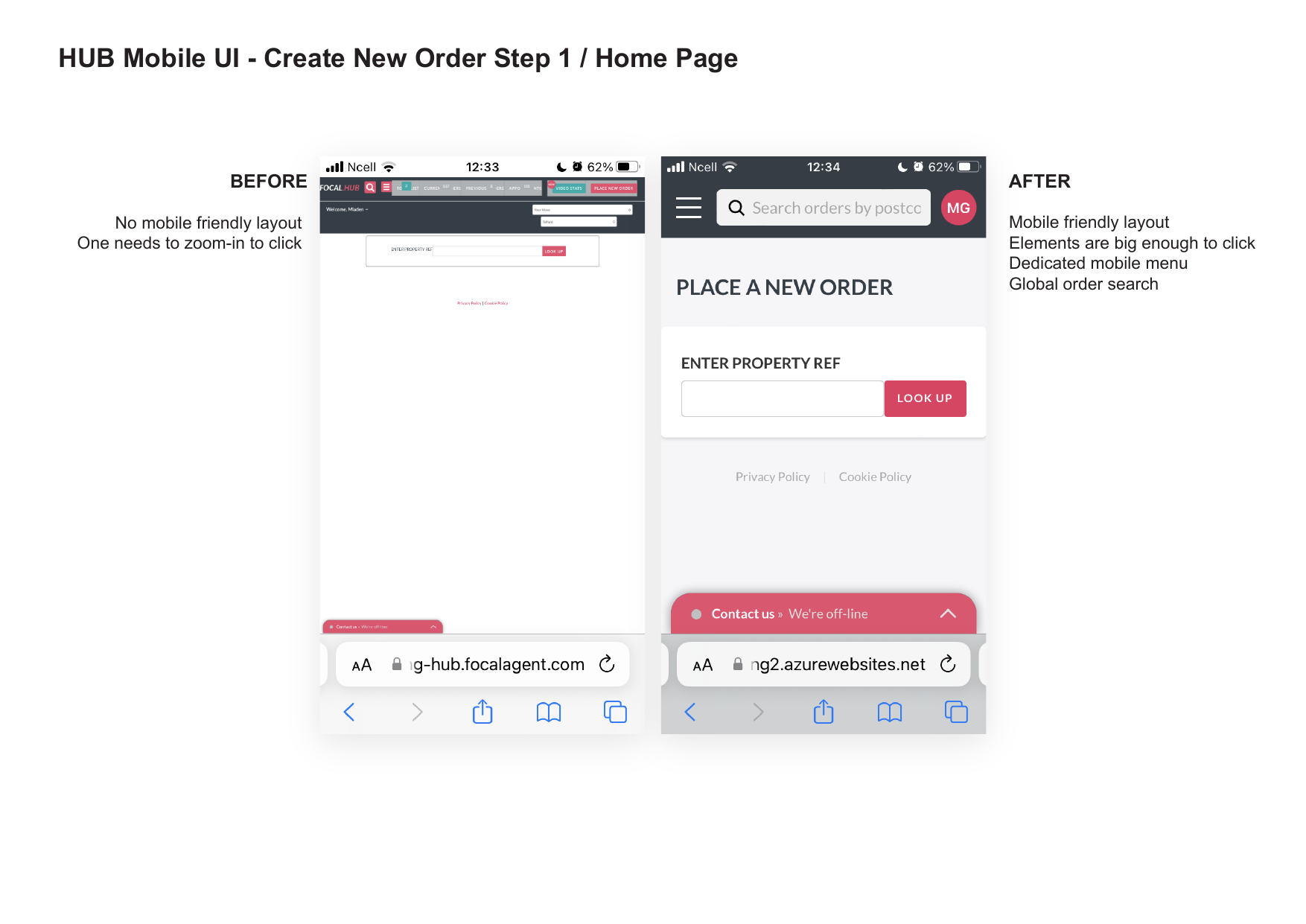
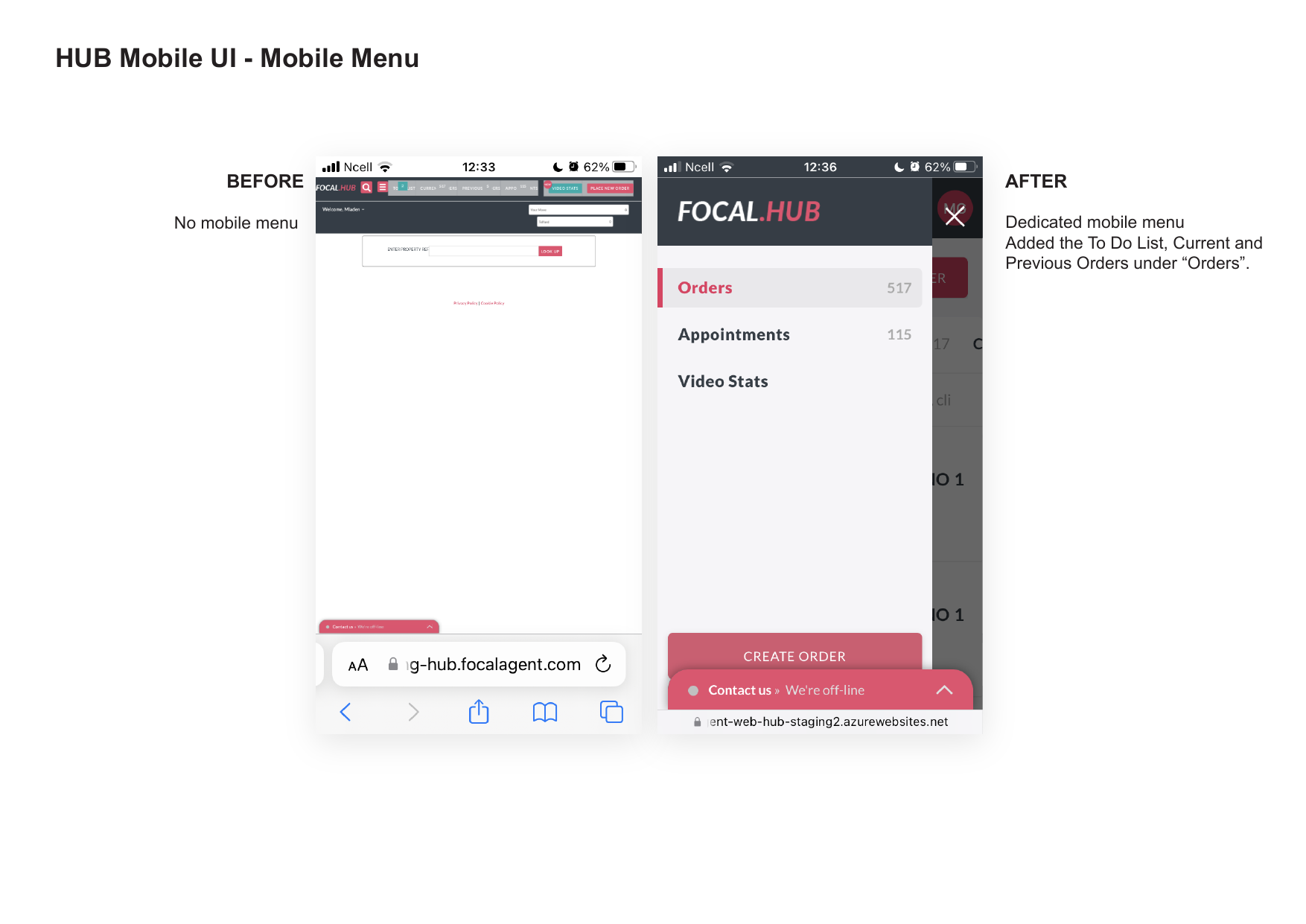
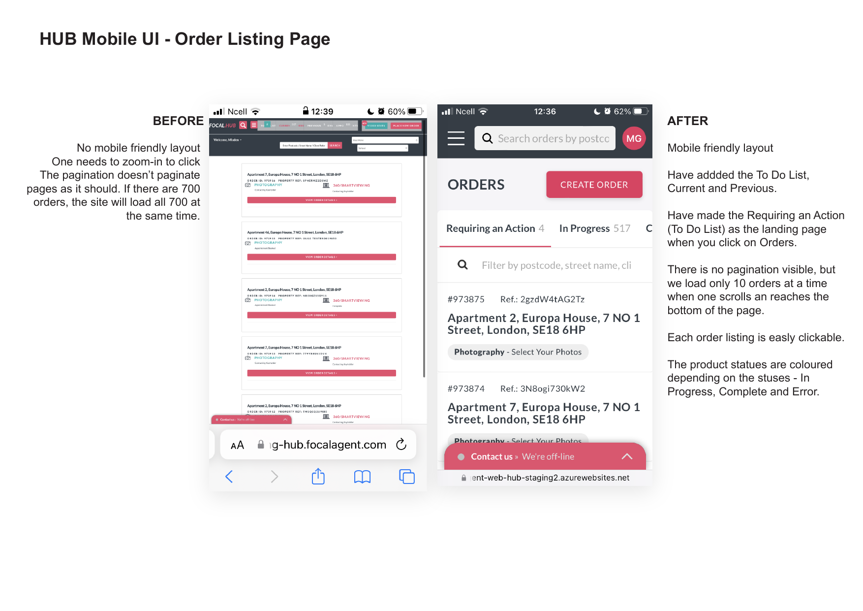
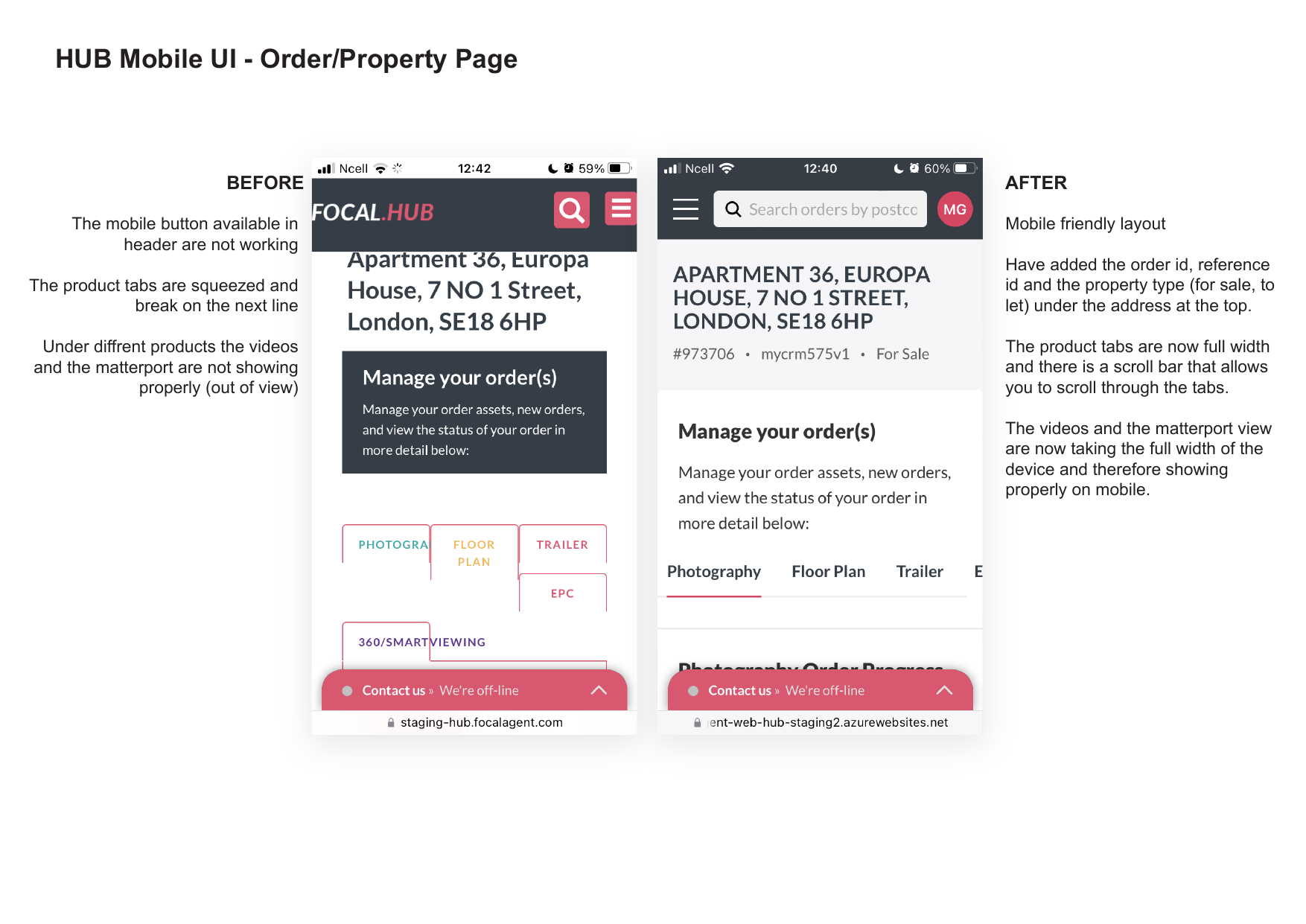
Making Focal Hub
actually usable on mobile.
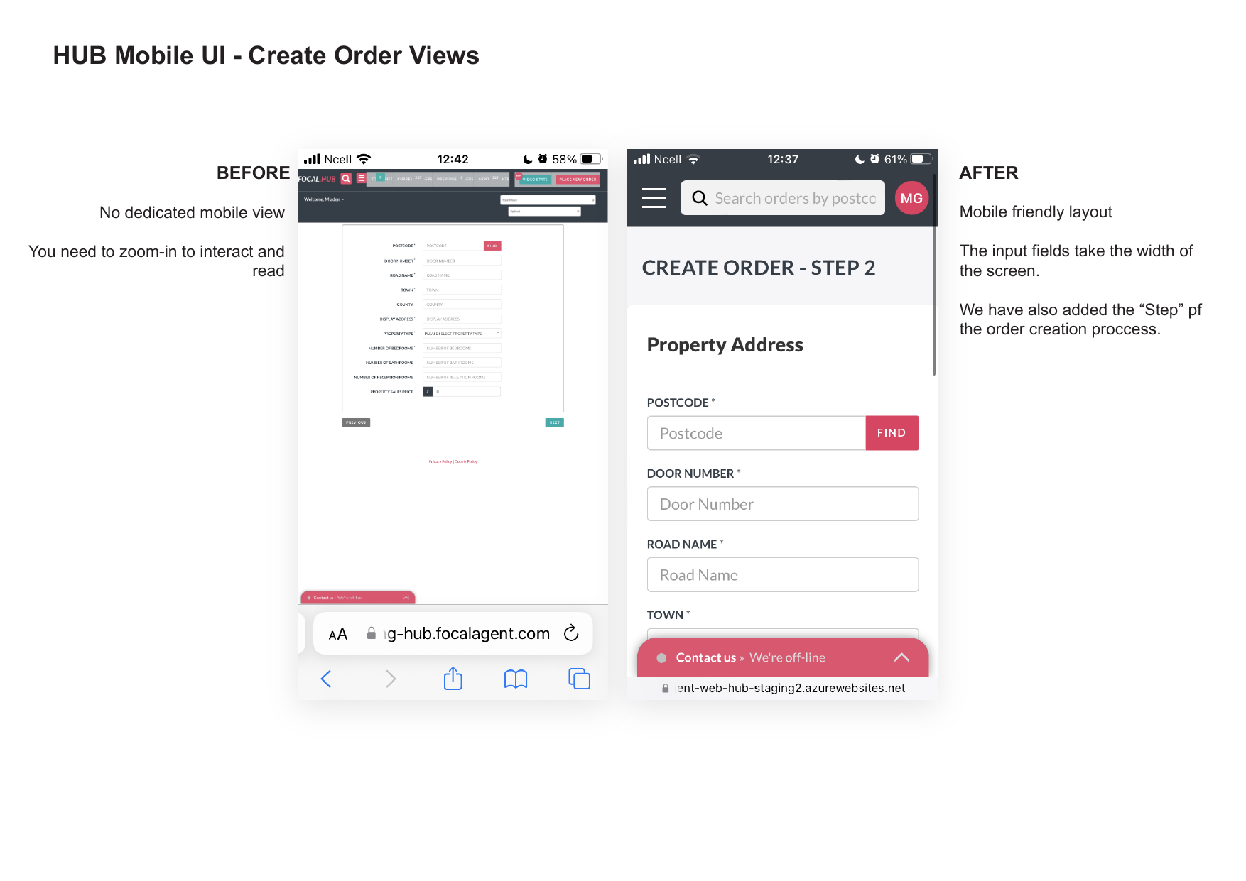
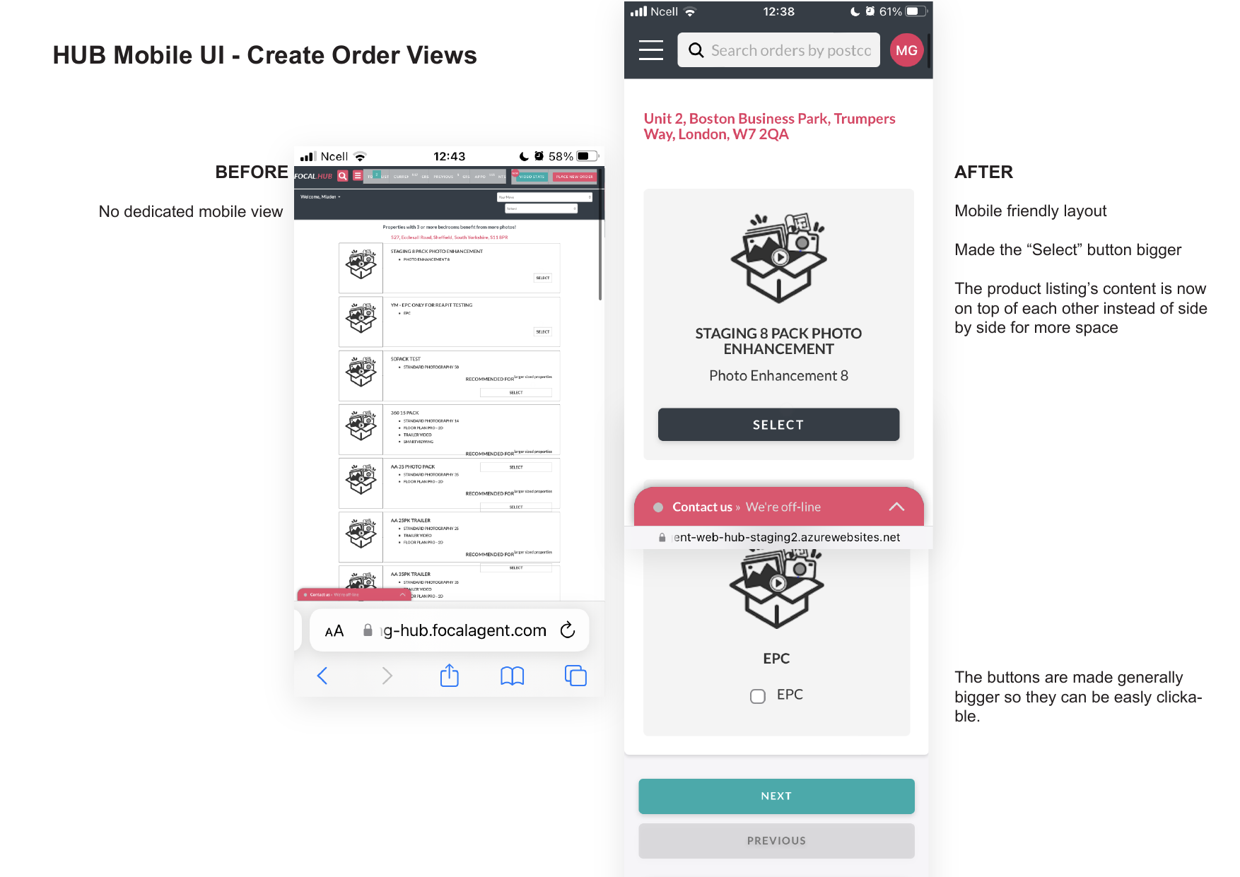
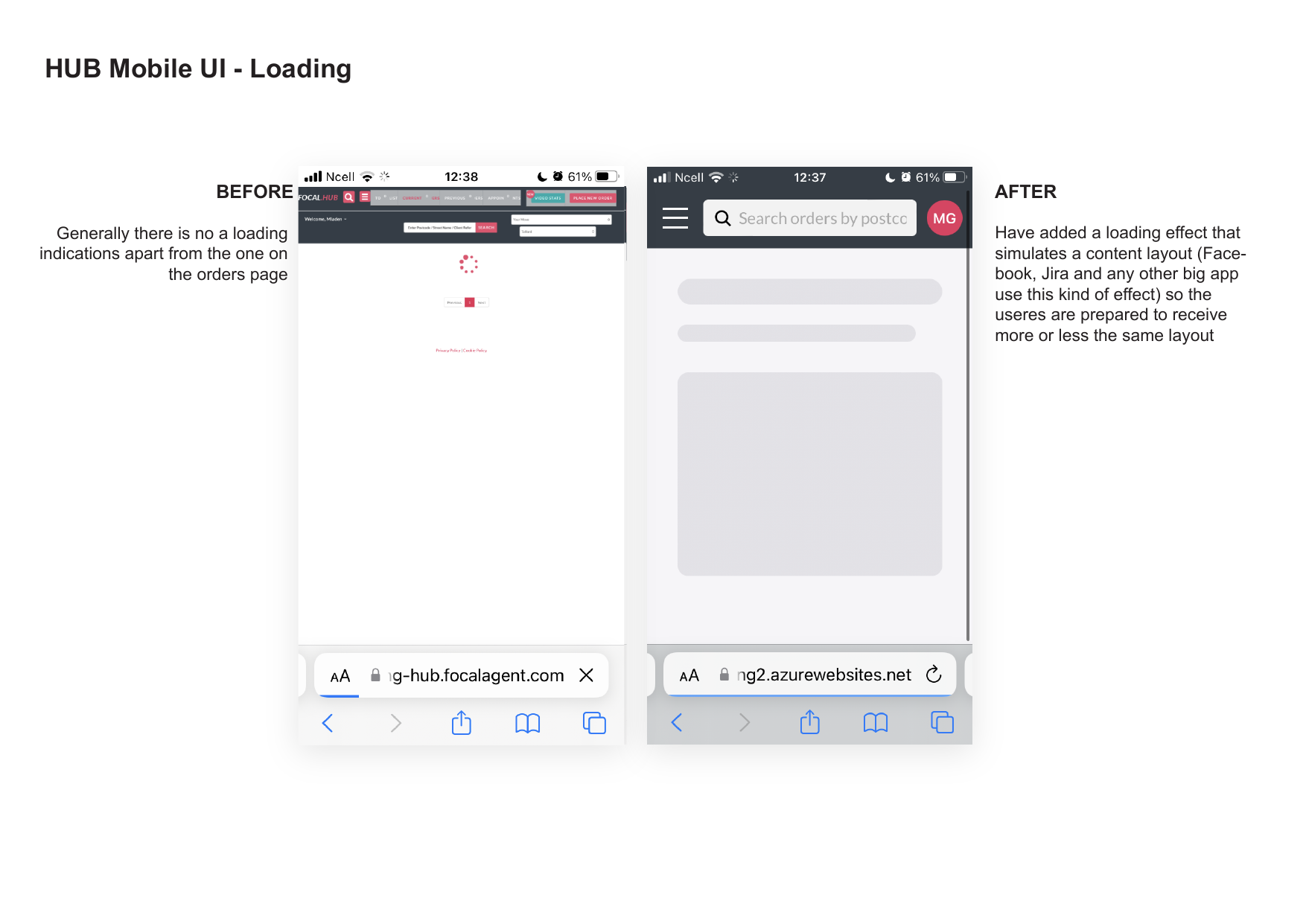
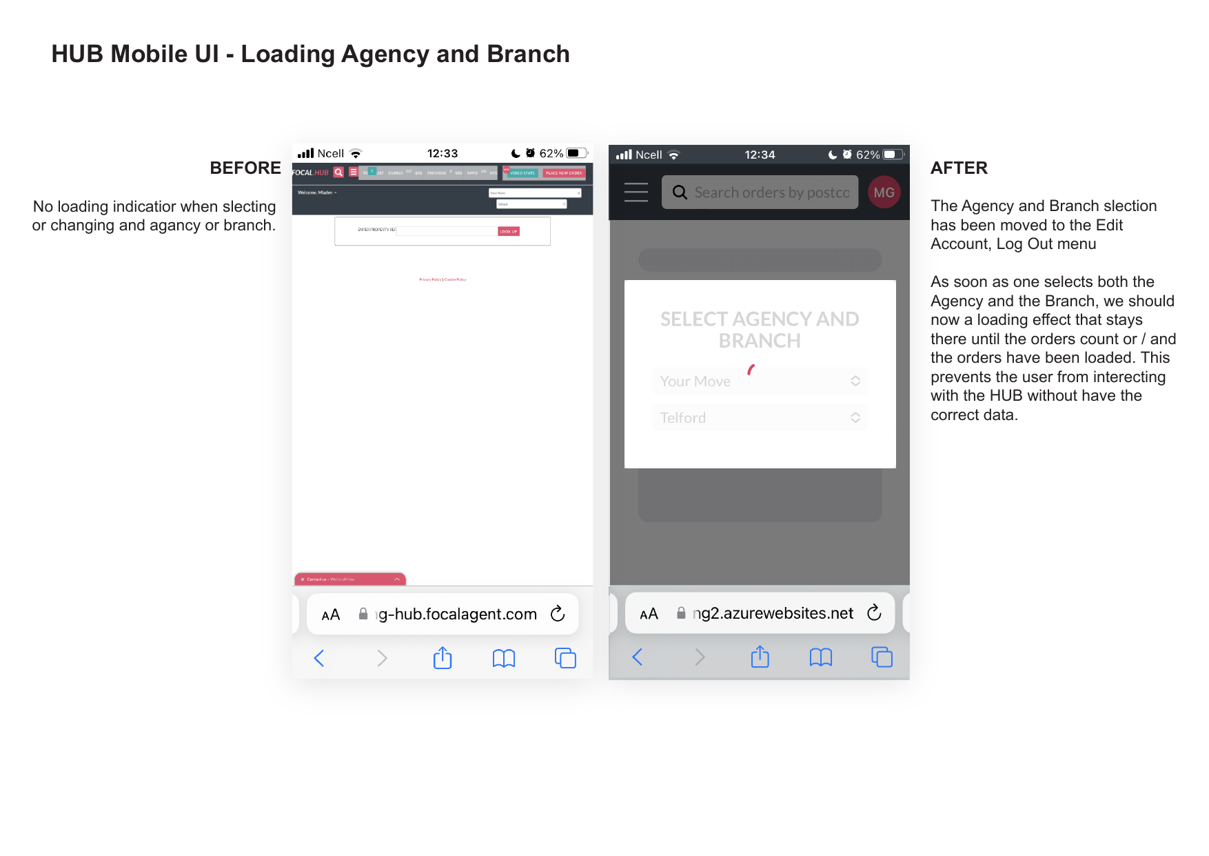
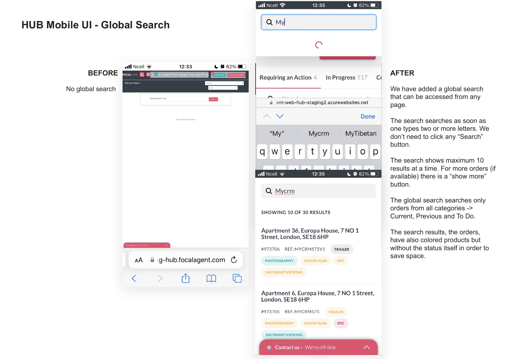
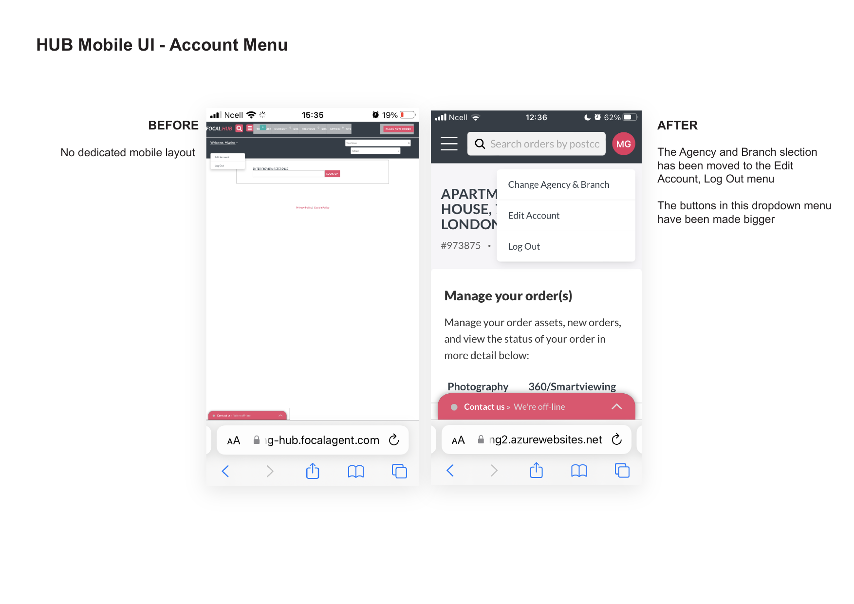
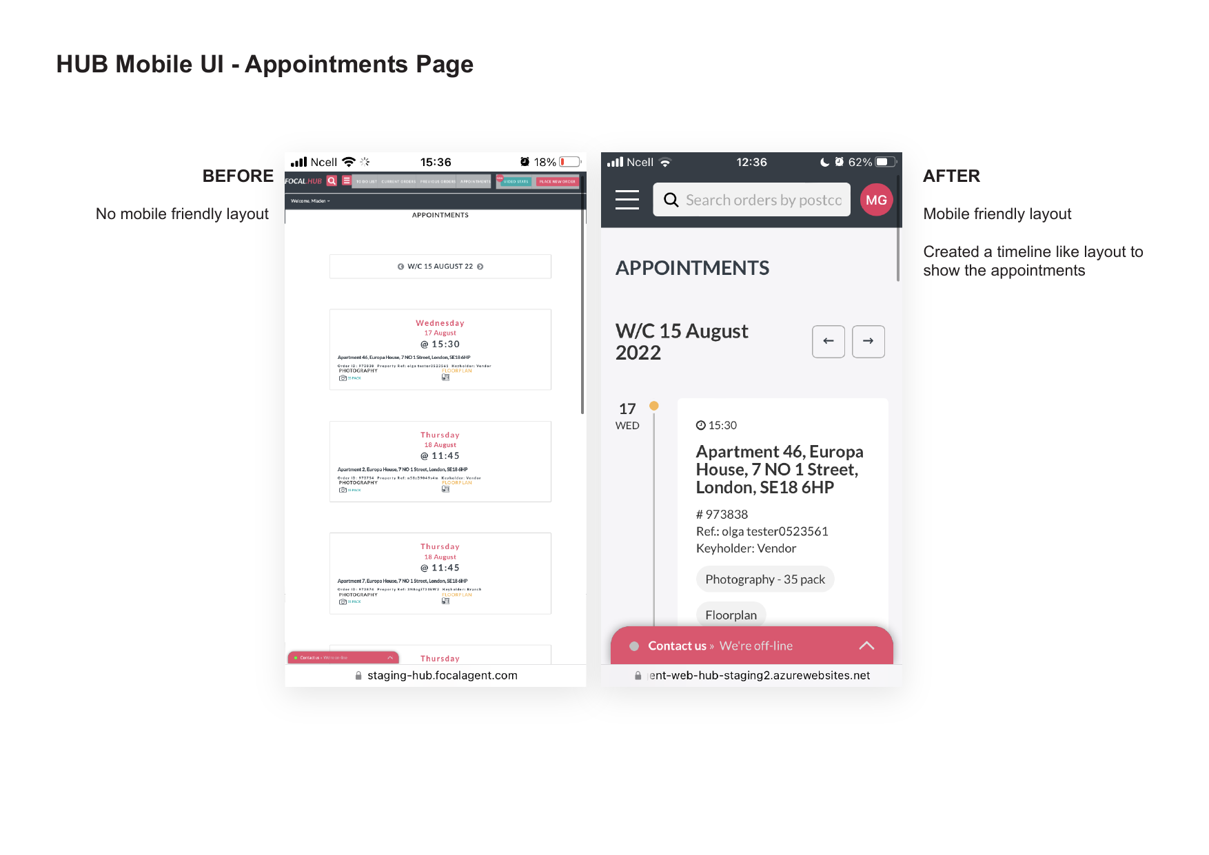
An incremental mobile + performance improvement project on a legacy internal operations platform. The goal was to make the Hub fast and usable on mobile without a full redesign (as a new Flutter app was planned for the future).
ROLE
UX/UI Designer & Product Design Lead
TIMELINE
6 weeks
IMPACT
Dramatically improved mobile usability & speed