Shopify E-commerce • 2021
UX & Conversion Focus
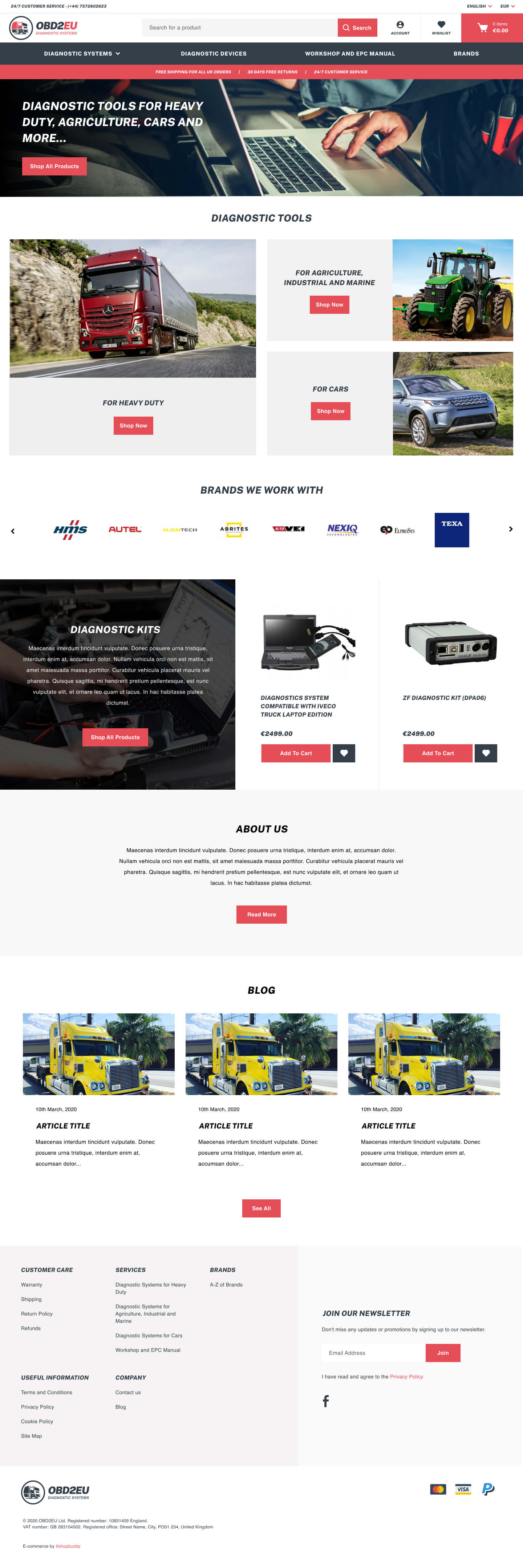
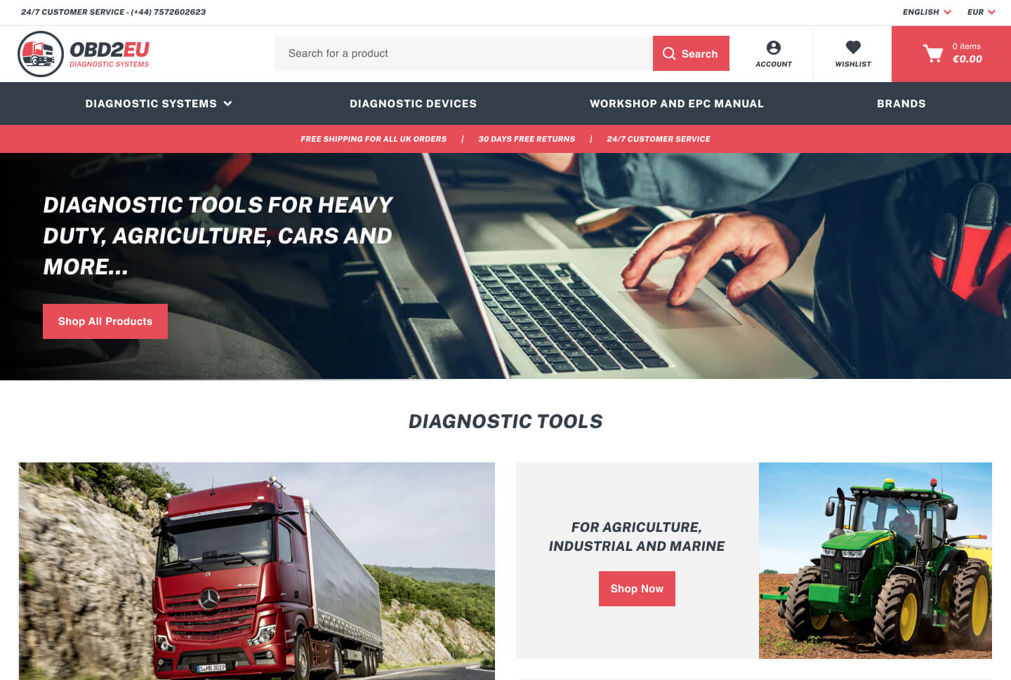
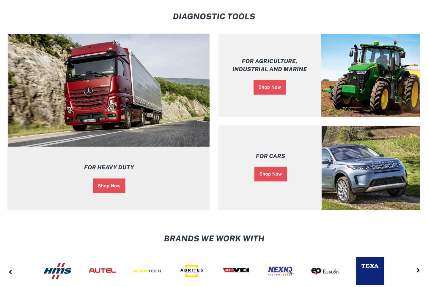
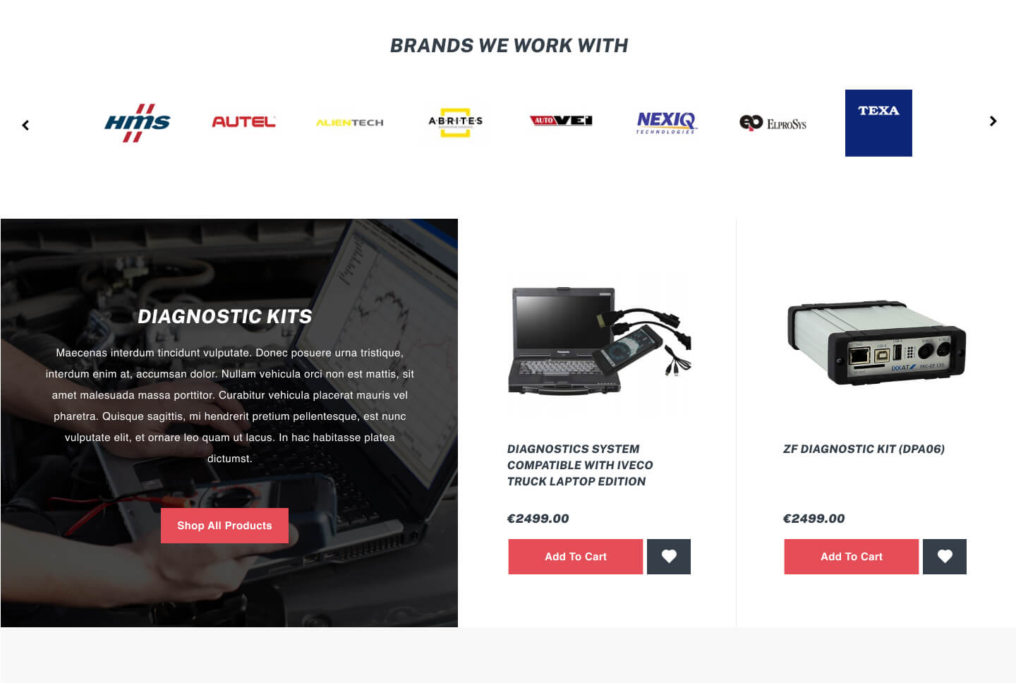
OBD2EU E-commerce
Redesign
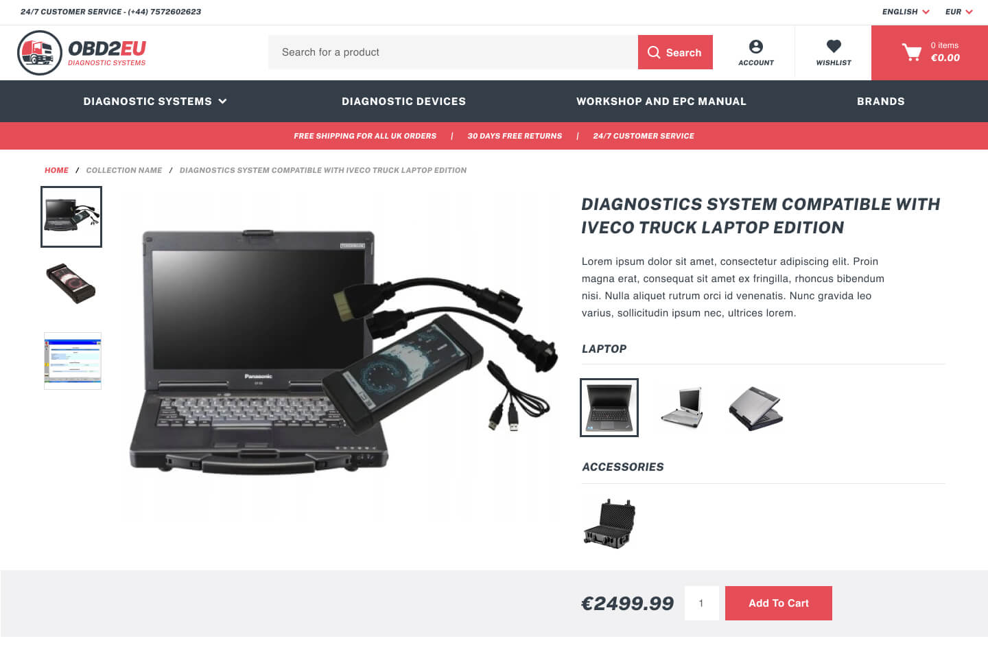
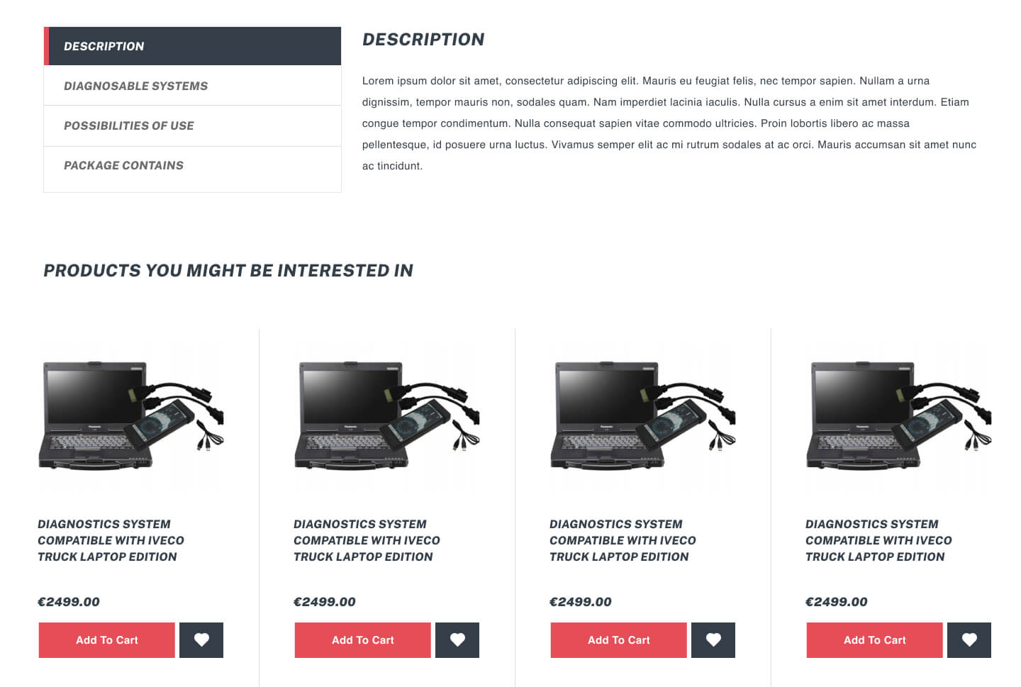
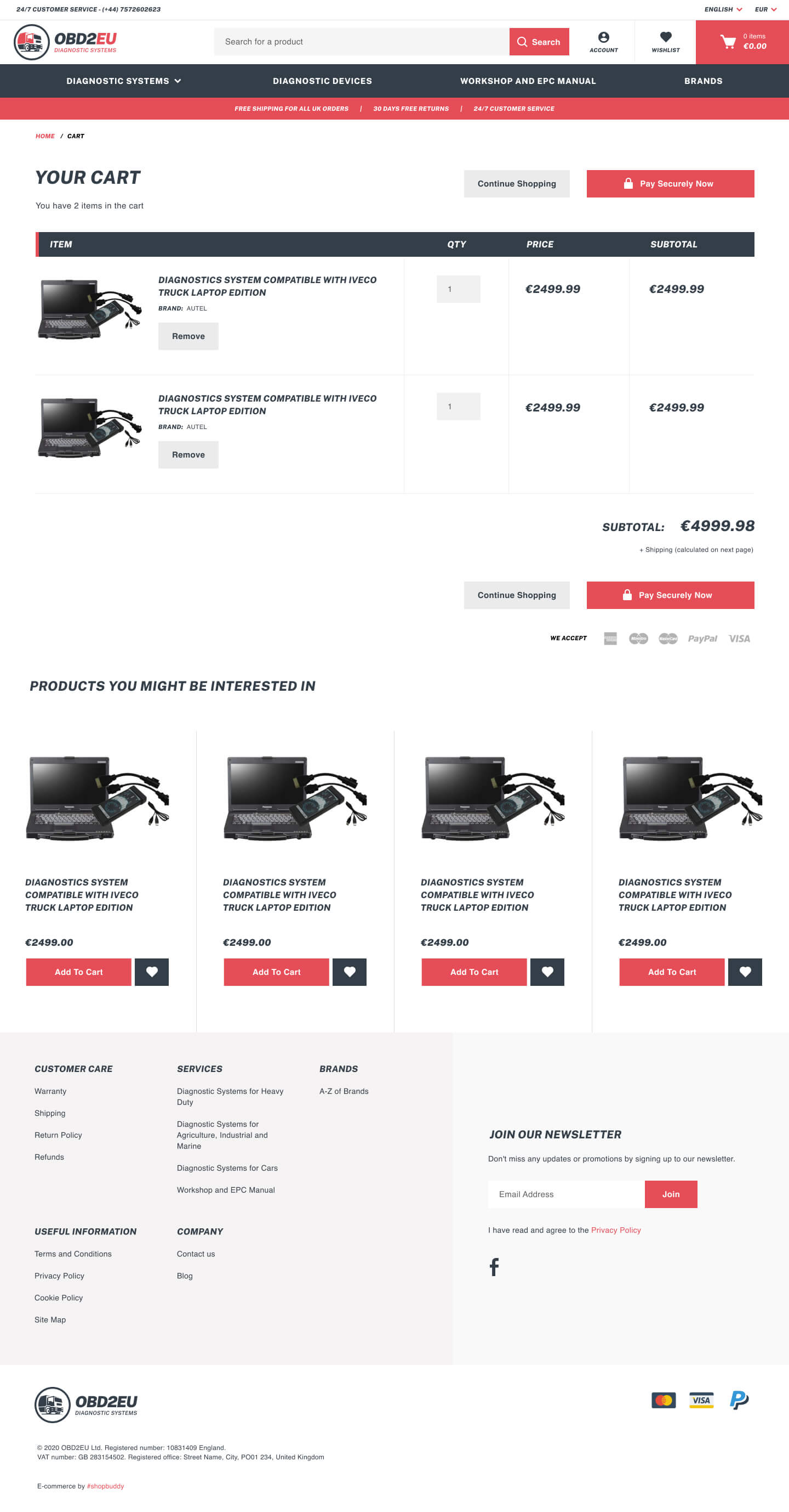
Redesigning an existing Shopify store for the EU arm of a diagnostic tools business already established in the UK — sharpening the brand, modernising the UX, and making technically complex products easier to browse and trust.
ROLE
UX/UI Designer (Solo)
TOOLS
Balsamiq · Sketch · Shopify
DELIVERABLES
Redesign · Wireframes · Hi-Fi Designs · Shopify Build